AWP Logos
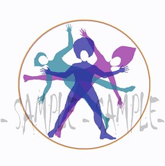
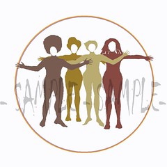
Below are the two designs I created for the use of the Association for Women in Psychology conference. (AWP organizing being one of those ongoing tasks I can't really quantify into a bar, but which certainly takes time anyway!)
While I was only supposed to be designing the Women of Color Caucus T-shirt, I had to start by desconstructing the original design that RS had anyway for what I had in mind. This was a black-and-white sketch of three intersecting figures that she found, and that people generally seemed to like for use as the overall AWP 2006 conference logo. I not-so-secretly hope people prefer my updated version--I do!
After I scanned in the B/W image, I electronically "traced" over the three individual figures to extract them. (More painstaking than it sounds!) Then modified each one to be more graphically appealing (i.e. redrew the hands entirely, reproportioned body parts that were obviously crooked after being disentangled from the others, etc.)
Then I made them into solid, block-print seeming figures. These figures I colored into warm earth-tones for the WOC shirt design (as well as moving the legs inward so the figures could "stand" more normally), and also created a fourth figure to round out the grouping.
At this point I had already done the hard work of updating the individual figures, so I took the three original figures and put them into a circle, re-creating the original "Intersections" image with a more "graphic" look.


